What keeps marketers up at night?
Cart and browse abandonment.
Picture this. You’re running a successful eCommerce store. You’ve worked hard to figure out your eCommerce platform, organize your marketing, achieve decent levels of traffic, and engage your customers with inspirational, finely crafted newsletters. But your sales aren’t reaching their full potential. Why? Because customers are dropping out before completing their purchase.
Cart and browse abandonment emails are a proven way to recover these lost sales. Of course, some shoppers may never have had the intention to purchase in the first place. But many shoppers are persuadable. In fact, the average Fresh Relevance client sending cart and browse abandonment messages makes $156K extra sales for each $1M of turnover (24% more than cart abandonment emails alone).
By working with over 500 eCommerce websites across a wide range of industries, we’ve learnt a thing or two about creating cart and browse abandonment emails that convert. Personalizing the ecommerce experience with behavioral triggers and tailored messaging has quickly emerged as ecommerce marketing best practice. Because it drives real results.
In this article, we’ll take a look at our top 10 favorite email examples and explain why they work. We’ll also cover how to set up your own abandonment emails and what to look for in an email abandonment solution, so that you can also send browse abandonment emails and cart abandonment emails to your potential and existing customers.
Learn more:
10 best practices for your cart and browse abandonment emails
The complete guide to cart abandonment
The complete guide to browse abandonment
Download now: 5 easy ways to make your emails perform better
Cart abandonment
Cart abandonment arises when a shopper leaves an eCommerce website after adding items to their cart, but without completing the transaction. Our research shows that over 61% of carts are abandoned. And whilst some shoppers may never return to the checkout, shoppers who got distracted before completing their purchase or abandoned to do more research can often be persuaded to return.
Here’s our top pick of best-in-class cart abandonment email examples that turn window shoppers into converted customers.
1) Zee & Co
We all know how important subject lines are when it comes to email marketing success. So make sure you give your cart abandonment emails a fighting chance by boosting your open rate with an ultra-targeted subject line. Zee & Co personalizes their subject lines based on the shopper’s carted brand, instantly reminding them of the brand they were interested in and harnessing the power of familiarity.
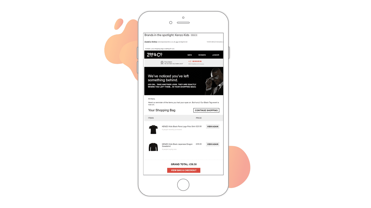
Source: Zee & Co email
2) Rip Curl
Chances are your potential customers are busy people and won’t be able to remember every detail of their abandoned cart, but your customer data can. Gently jog their memories by recreating their shopping cart in your cart abandonment email. Make sure your email marketing strategy includes product images, descriptions and prices to help them recall the items they added to their cart, as Rip Curl has done in this example. This tactic has paid off for Rip Curl, as they’ve seen a 10.3% sales uplift from their abandonment emails.
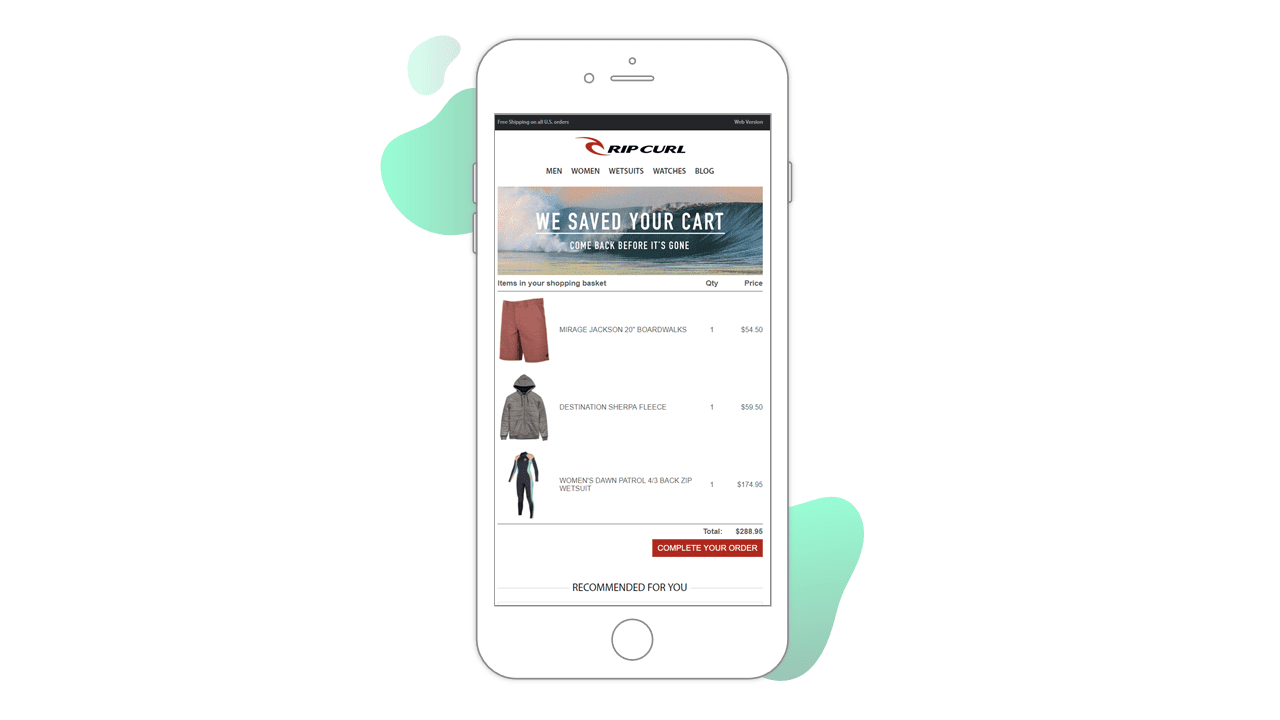
Source: Rip Curl email
3) Vision Direct
We know you could wax lyrical about the life-changing qualities of your products all day long, but now is not the time to go in for the hard sell. These shoppers got as far as your checkout page – they’re already interested in what you have to offer. But perhaps they didn’t get all the information they needed to make a purchase, or maybe they were unsure about your returns policy. Whatever the issue, adopt a customer service tone and use your cart abandonment email to showcase your helpfulness. Vision Direct keeps their cart abandonment emails short and sweet, providing their contact details, store rating, and useful information about deliveries.
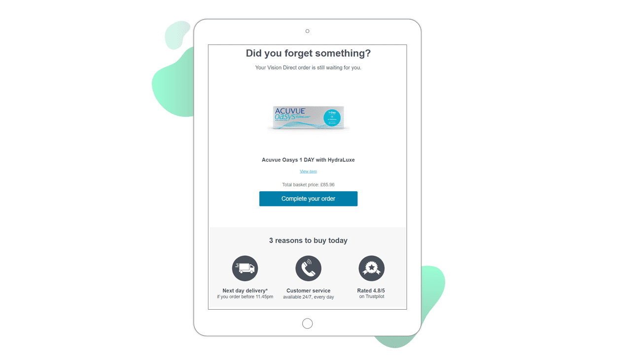
Source: Vision Direct email
4) Glasses Direct
1 in 3 consumers read up to 4 product reviews before making a purchase decision and over half of consumers look for star ratings when deciding whether to buy. Use social proof to convince your potential customers and ease purchase anxiety with star ratings and reviews in your cart abandonment emails. This will be especially effective for shoppers who got cold feet before completing their purchase. Glasses Direct includes the carted product’s star ratings and links to product reviews in their cart abandonment emails.
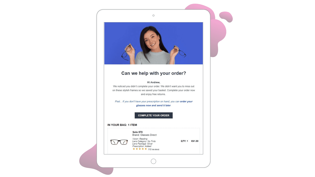
Source: Glasses Direct email
5) Cottages.com
For shoppers who are teetering on the brink of converting, the addition of social proof can also be used to drive urgency and speed up the purchasing process. Displaying real-time information of how many other shoppers have bought or browsed those same products recently could be the final nudge a shopper needs to complete their purchase, a tactic Cottages.com has utilized in their cart abandonment emails. This technique is particularly effective for holiday home letting companies such as Cottages.com, where availability is finite.
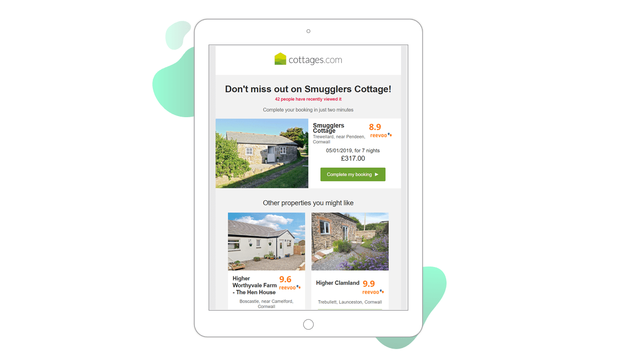
Source: Cottages.com email
6) Markwins Beauty Brands
Abandonment emails present the perfect opportunity for upselling. In this example, health and beauty retailer Markwins uses dynamic delivery information to show the shopper how much more they would need to spend to qualify for free shipping, a tactic that serves to increase the shopper’s cart value.
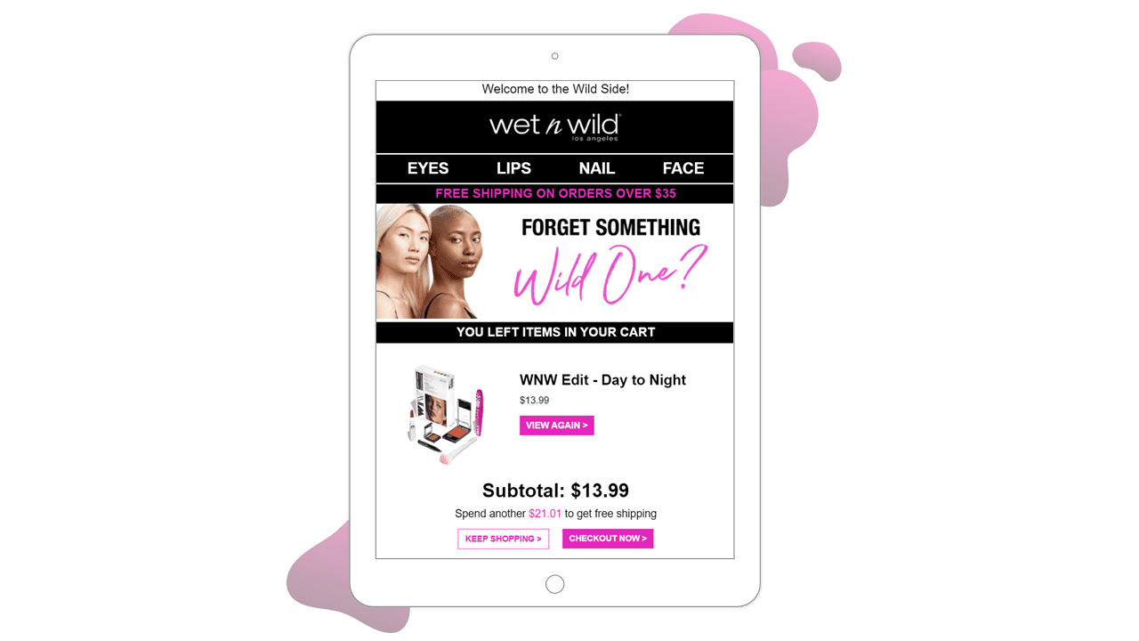
Source: Markwins Beauty Brands email
7) Kleertjes.com
Why stop at just one cart abandonment email when multi-step cart abandonment emails are the best way to get your shopper back to that checkout page? On average, sending a multi-step cart abandonment program generates a uplift of 21% compared to a single cart email.
Kleertjes.com has seen a 347% YOY increase for cart abandonment revenue and a 126% YOY increase for browse abandonment revenue with their multi-step abandonment emails. Their first abandonment email is sent within 30 minutes of a shopper abandoning their cart and a second email sent 24 hours later if the shopper hasn’t taken action.
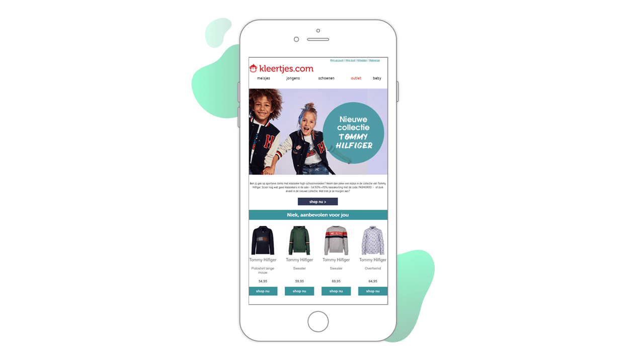
Source: Kleertjes.com email
Browse abandonment
Browse abandonment occurs when a shopper visits your site, looks at your offerings, but leaves without adding anything to their shopping cart or making a purchase. There are many reasons why browse abandonment occurs. It could indicate some shoppers find your navigation clunky – read more here – or perhaps they couldn’t find the exact product they were looking for. They could simply have been distracted by a phone call or their lunch break came to an end. But before you start scratching your head wondering what you did wrong, all is not lost. Our research shows that sending browse abandonment emails can lift sales 4.7%.
Here’s our top pick of best-in-class browse abandonment email examples.
8) Viovet
Your shoppers might have abandoned their browsing session to do some more research before they purchase. Give them a helping hand by sending them inspiring content to aid their research. Viovet sends their shoppers informative articles from their blog that relate to the browsed products within their browse abandonment emails.
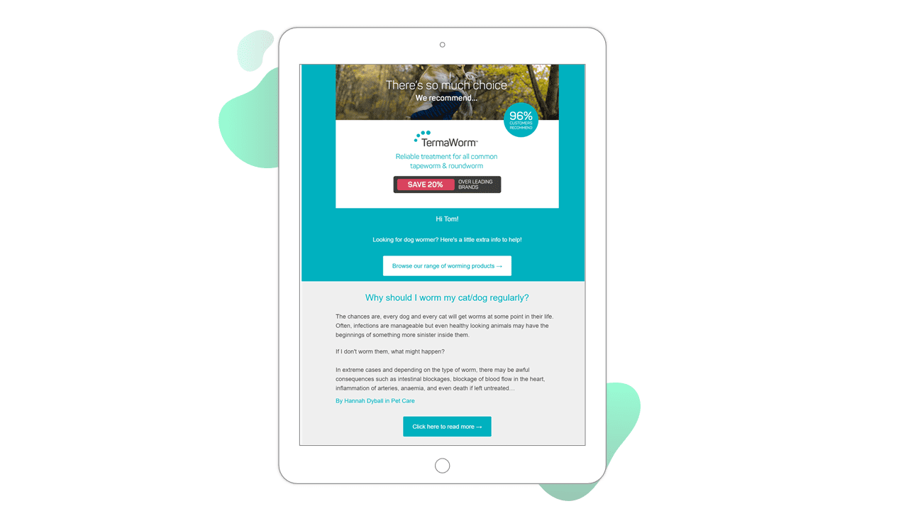
Source: Viovet email
9) The Diamond Store
Product recommendations can be a welcome addition to browse abandonment emails, offering the shopper more options and helping them find that perfect product. Show your shoppers similar alternatives to make their purchase decision easier. You can also take the opportunity to cross-sell and up-sell by inspiring shoppers with items that complement the one they have browsed.
The Diamond Store offers six tailored product recommendations alongside the shopper’s browsed items within their browse abandonment campaigns.
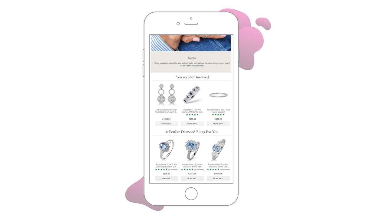
Source: The Diamond Store email
10) FFX
As we saw in the Rip Curl example, it’s important to jog your shoppers’ memories and remind them of the products they browsed or carted. Since you don’t have a cart to recreate in this case, a dynamic banner with the browsed brand is an effective way to bring your products back to your shopper’s mind.
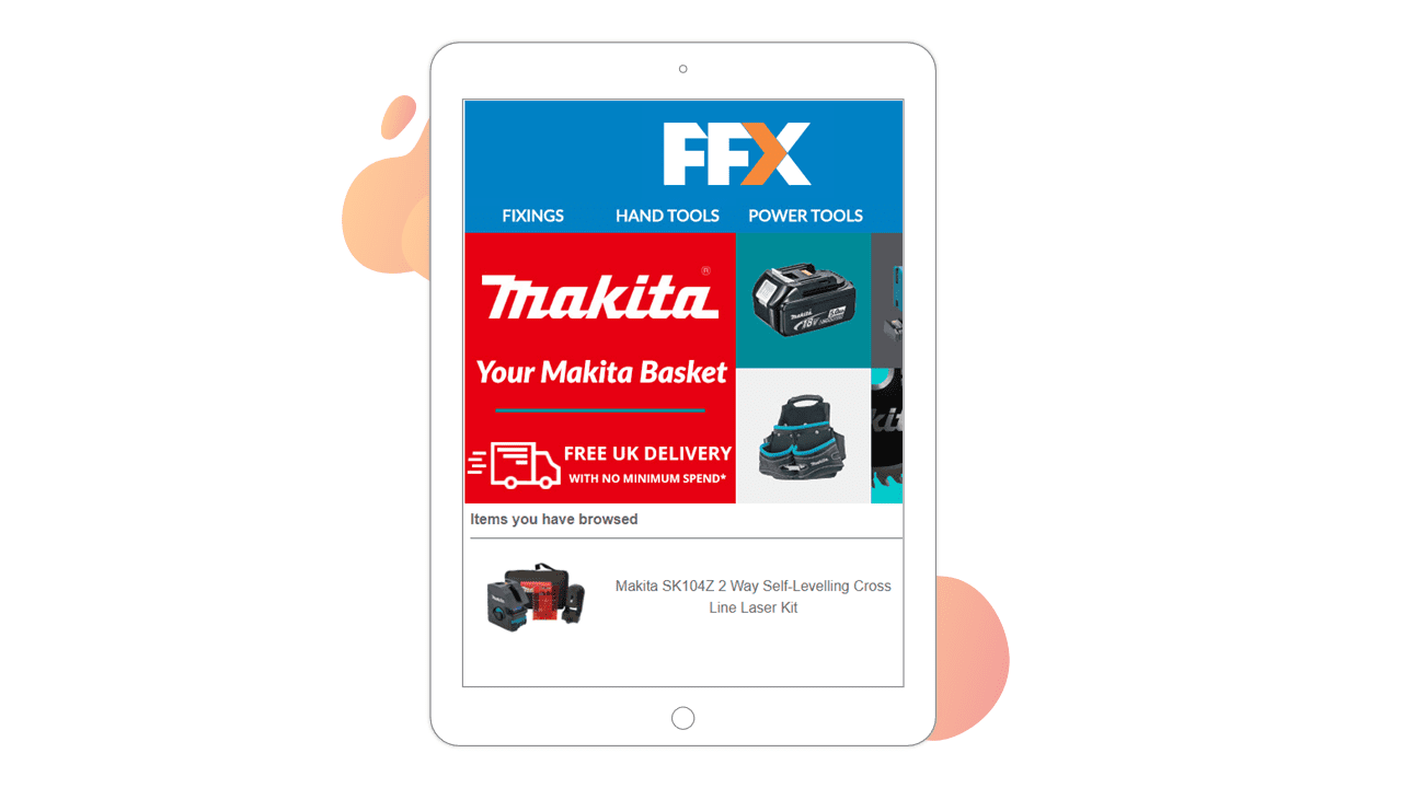
Source: FFX email
Bonus example
11) Flash Pack
We couldn’t resist…Here’s an extra example for the road. Abandonment emails present the perfect opportunity for travel brands to ramp up the wanderlust and inspire shoppers with tailored ideas for their next trip. Flash Pack includes four tailored trip recommendations along with the browsed destination in their browse abandonment emails. With research revealing that nearly half of holidaymakers spend longer researching a trip than the duration of the holiday itself, offering tailored product recommendations could help your browse abandoners make a decision.
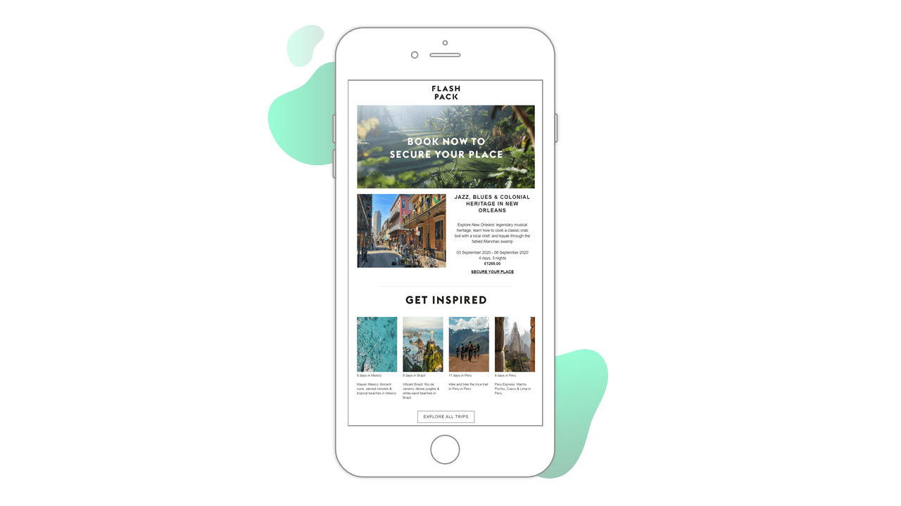
Source: Flash Pack email
How to send abandoned cart and browse emails
Cart and browse abandonment emails are similar to your existing marketing emails with the addition of a block of carted or browsed products.
How to choose a shopping recovery solution
Look for a solution like Fresh Relevance that allows you to:
- Create cart and browse abandonment emails in your existing ESP, based on your existing email templates
- Rebuild the shopper’s abandoned cart, even if they click through the email on a different device
- Flexibly configure email sending and reporting according to your business needs
With the right solution, cart and browse abandonment emails are simple to set up and can deliver a significant return on investment. For more tips and tricks, get our five easy ways to make your emails perform better.
Disclaimer
This blog post is for informational purposes only. Fresh Relevance is not claiming to provide its services to the companies and brand owners referred to in the blog post.


