Pop-ups and popovers are an online store staple. But many marketers have misgivings about using this feature on their eCommerce websites. That’s understandable. In their awkward adolescent phase, pop-ups were often annoying, intrusive and random.
However, today’s popovers have evolved to enhance the customer experience with relevant offers and content. They can be used to identify customers with data capture, encourage micro conversions such as newsletter sign-ups, and recover revenue with cart and browse abandonment messages.
Keep reading for 4 popover best practices, and discover 5 types of popovers that improve the customer experience. Plus, find out how to ensure your popovers are SEO-friendly.
What Exactly is a Popover?
Marketers’ apprehension about popovers stems from the days of cringe-inducing pop-ups. These smaller windows that appeared on top of the webpage were intrusive and interrupted the user’s flow, and are the reason we turn to pop-up blockers to make our browsing experience easier.
A well-timed popover is the pop-up’s better-behaved cousin. They often take the form of overlays that make up part of the webpage. You can normally dismiss them by clicking elsewhere on the screen. These are most effective when they are related to a visitor’s interests and behavior on your website.
4 Popover Best Practices
Before we dive into popover UX types and examples, here are four ways to make sure your popovers are as engaging as possible.
1) Timing
No one likes to be interrupted. A popover that seems to appear for no apparent reason could cause potential customers to leave your website. That’s where behavioral popovers come in…
2) Context
The best way to get the timing right is to serve popovers in response to browsers’ behavior. To work out whether to use a popover – and what content to include – consider the shopper’s interests, lifecycle stage, and place in the buying journey.
3) Content
Don’t let design be an afterthought. A great popover makes your brand look professional and trustworthy. To maximize engagement, include a compelling call to action and clearly show the value you’re offering. Don’t put shoppers off by asking for too much information. Once you have a visitor’s email address, you can get to know them better.
4) Testing
Ensure your popovers are doing a good job by continually testing and optimizing. Try out different timing, placement and content to find out what works best for your customers.
With these best practices in mind, let’s look at 5 types of popovers that improve the customer experience, along with best-in-class examples to inspire you.
5 Types of Popovers That Improve the Customer Experience
1) Discount Popover
The easiest way to build a relationship with customers is by identifying them through their email address and tailoring your marketing to their behavior. When a new visitor comes to your website, you can present a popover offering a discount on their first order when they sign up.
This serves two purposes: the visitor identifies themselves with their email address and is tempted to make a purchase.
Remember to be mindful of timing. Give shoppers enough time to view your website so they know what you have to offer.
Here’s an example from Vision Direct and Glasses Direct.
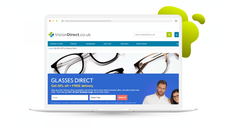
This popover is used to cross-market the company’s different brands. The message is tailored to visitors’ interests, as it only appears once you’ve browsed a related page. Content is big enough to get shoppers’ attention, but doesn’t feel intrusive as it can be easily collapsed.
Popovers don’t need to take center stage. This example from Feel Good Contacts sits at the bottom of the window as browsers move through the website. The message is clear: “When you’re ready to make an order, I’m here for you!”
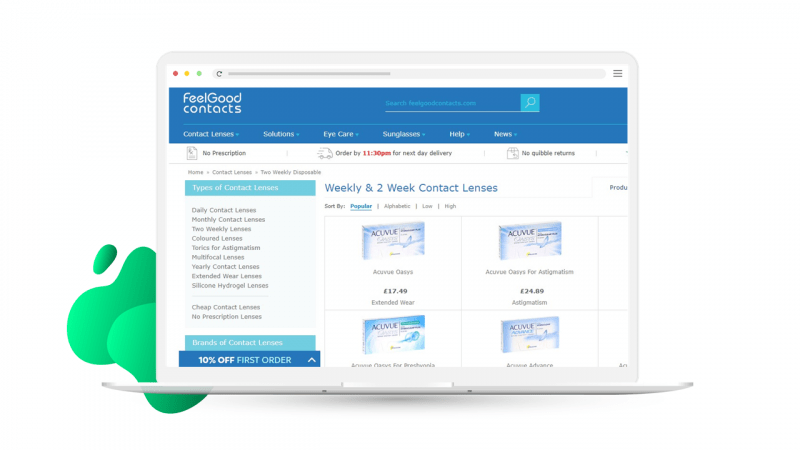
Learn more about how Feel Good Contacts achieved a 333% increase in sign-ups with targeted popovers.
2) Sales Promotion Popover
Another effective way to encourage sign-ups is by promoting sales and giving shoppers the chance to be the first to hear about exclusive discounts.
LSE Retail’s data capture popovers on their Iconic Lights and Value Lights websites were first implemented for Black Friday to capitalize on the increase in new visitors during this busy shopping period. The popovers were displayed to new visitors with a 10% discount off their first order. This tactic paid off for LSE Retail, as their new visitor sign-ups increased by 75% over the two months the popover was displayed.
![]()
3) Product Recommendations Popover
Popovers aren’t just for data capture. Try adding product recommendations to your popovers to draw shoppers’ attention to specific items.
Vapouriz triggers a popover on the pages of products that are out of stock, recommending alternative products for customers to purchase instead. This avoids a potentially frustrating out-of-stock experience as customers are immediately presented with similar products they can purchase now.
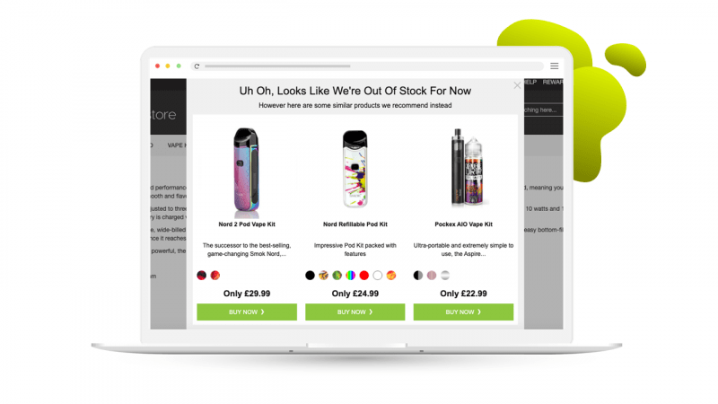
Learn more about Vapouriz’s popover success story.
4) Cart Abandonment Popover
Did you know that 60% of shopping carts are abandoned? That’s a lot of potential purchases that are never completed.
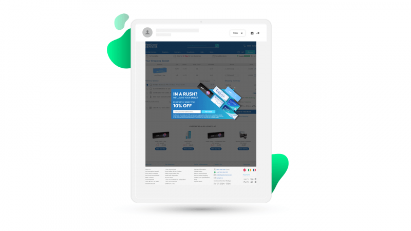
Along with cart abandonment emails, exit intent popovers give marketers the power to recover this lost revenue. You can offer to take the customer back to the cart page to complete their purchase, or ask them to sign up for a reminder email.
Feel Good Contacts give shoppers the option to have their basket emailed to them in exchange for their email address, along with the offer of a 10% discount to incentivize them to complete their purchase and share their details.
5) Welcome Back Popover
Some visitors leave without making a purchase, and return at a later date. This is an opportunity to help shoppers by letting them pick up where they left off.
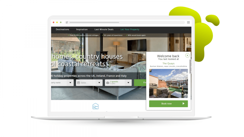
Use a popover to remind visitors of their last viewed product. Shoppers will appreciate the gesture, as they don’t have to remember what they searched for last time.
Include an image of the product, and make it clear why the popover is appearing. This example from Cottages.com gives a helping hand to returning customers, without obscuring the rest of the information on the page.
Popovers and SEO
Google is now devaluing websites with intrusive pop-up ads, specifically intrusive interstitials. (An interstitial is a page that appears before the expected content.) This is a mobile penalty, but because Google’s indexing is now mobile-first, it might have a bigger effect on your position in the SERPs. It’s worth noting that Google doesn’t penalize all pages with interstitials, only the ones which searchers can land on from search results, which means you can still display an interstitial when a user navigates between different pages of your site.
Interstitials are considered intrusive if they make it harder for users to use your site, for example if they are difficult to dismiss or if they cover the main content immediately after the user navigates to a page from the search results.
Banners that use a reasonable amount of screen space and are easy to dismiss will not harm your page’s organic ranking. Exit intent pop-ups are also unaffected.
With Fresh Relevance, you have complete control over the look and feel of your popovers, as well as control over when your popovers display. We recommend adding a time delay or only displaying a popover after the user has browsed a certain number of pages.
Another important SEO consideration is the pogo stick effect, which is when users go back and forth from a search engine results page (SERP) to an individual search result destination site. These events are measured in Google Analytics under bounce rate, and web pages with a high bounce rate may fall out of view in search results. So when it comes to pop-ups, you should ensure that any interstitial you add to your website isn’t annoying your visitors and negatively impacting bounce rate. Fresh Relevance users can measure this directly in the platform via our Testing and Optimization module.
Get the Most Out of Popovers
To give shoppers a personalized experience across web and email, it’s important to identify as many visitors as possible.
That doesn’t mean harassing visitors with intrusive pop-ups and data capture forms. Use the 5 types of popovers presented here to enhance the customer experience, while meeting business goals such as growing your subscriber base and recovering revenue.
Discover more tactics to improve the customer experience and convert more shoppers in our Ultimate Ecommerce CRO Lookbook.


![Download The Ultimate Ecommerce CRO Lookbook [new visitors edition]](https://no-cache.hubspot.com/cta/default/483487/92218b40-727e-435a-9ff8-63a34cf403a2.png)
