Capturing the attention of busy shoppers and driving them toward a purchase decision is crucial. Countdown banners can be a powerful tool for accomplishing that task for the eCommerce marketer. They offer a unique way to create a sense of urgency and excitement and offer an avenue for personalization, which can significantly enhance the customer experience and boost sales.
This blog post delves into the effectiveness of using countdown banners as a personalization tactic in eCommerce marketing.
What are countdown banners?
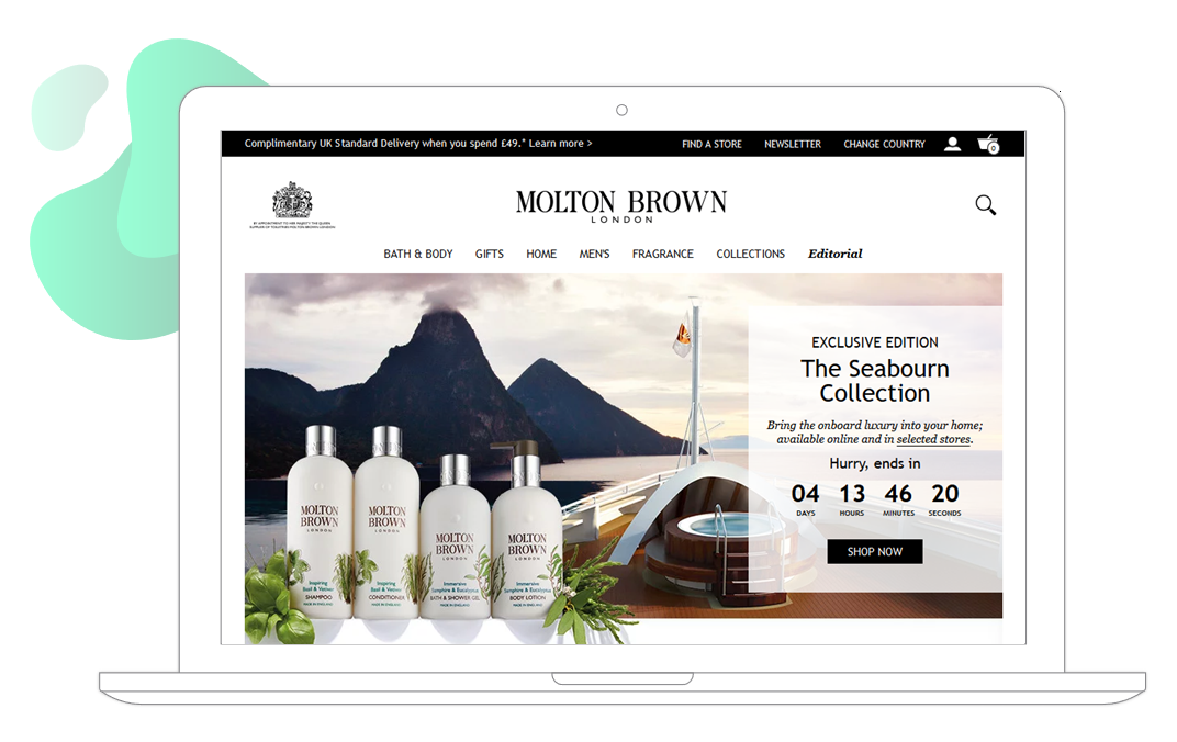
Countdown banners are dynamic content blocks in emails and web pages that use animation and a sense of urgency to boost engagement and encourage sales. These animated timers are great for making an impact, attracting attention, and improving page performance; the only limitation is your imagination!
The time ticking away creates a sense of urgency, compelling shoppers to act quickly to take advantage of limited-time offers. The psychological push caused by a fear of missing out (FOMO) drives shoppers to make faster decisions, increasing impulse buys and conversions.
Countdown banners can help promote the beginning or end of a sale or highlight a shipping deadline. They are also great for hyping events such as Black Friday or Valentine’s Day and can be used to highlight special store hours or customer support availability.
Types of countdown banners
The mechanism is basically the same but the messaging is different. Here are eight inspiring examples of countdown banners from eCommerce merchants who are using them to drive engagement and increase conversions.
Website countdown banner:
Cottages.com uses a countdown timer to display the cut-off date of their latest offer. This is especially effective as research has shown that more than 1 in 4 consumers (28%) want retailers to highlight important order cut-off dates.
Event countdown timer:
For events such as opening a new store, or seasonal events both online and offline, keep your visitors informed by counting down to the big day.
Product launch countdown banner:
When launching a new product, keep your customers engaged and excited until the launch. Alongside this countdown banner in Finish Line’s email is a count of the sizes still in stock.
Sale or promotion countdown banner:
Increase urgency to take action or offer a “reminder” for a certain deadline. For example, by including the time until your 48-hour offers end in your email header. You can use a countdown timer with or without animation.
App launch countdown timer:
Launching an app is a big deal for you and for your shoppers. Stoke their enthusiasm with a countdown timer on your website and in your emails.
Booking or reservation countdown banners:
Travel agencies can increase online sales and boost visitor engagement with a countdown timer in their website navigation bar. You could also highlight your next-day delivery cut-off time.
Abandoned cart countdown banners:
FFX added dynamic hero banners to their cart recovery emails with recommended products complementary to those in their shopper’s cart. The emails had an impressive 45% click-to-open rate. You could increase the urgency to purchase by including a countdown to a discount or a shipping/pickup deadline — as Lloyd’s Pharmacy has done in this email.
Other types of countdown timers:
Managing email signatures with Fresh Relevance is easy. Use a countdown timer in your email signature to catch your reader’s eye, and tempt them into clicking through to your site to avoid missing out on the offer. You can automate the process even more by setting an end date for the offer countdown timer and specifying the fall-back content asset to show in the email signature after the offer has expired. The platform will automatically swap out the assets when the offer ends.
How to use a countdown timer with your call-to-action (CTA)
A countdown timer is not just another pretty face. This marketing tactic is a machine built for action. One of the most important ways you can ensure the timer does more than just tick away the hours is to accurately message and position the timer and its call-to-action (CTA).
- Position the timer near the CTA button to create a sense of urgency.
- Ensure the timer is visually striking, complementing the design and color scheme of your brand.
- The countdown timer and CTA should align with the offer deadline, such as a sale or event registration, and encourage immediate action.
- Keep the message clear and concise, highlighting the limited availability or exclusivity of the offer.
This strategy leverages the psychological principle of scarcity, prompting users to act quickly to avoid missing out on the opportunity presented by the CTA.
Here are some other tried-and-true best practices you should follow.
Don’t cry wolf. Countdown timers are used to show urgency. If they are used too often, the clamor and weightiness of the ticking clock disappear. And never mislead your shoppers or make unfair urgency claims (e.g., countdown timers reset once they’ve counted down to 0, etc.).
Optimize timer placement and design. Countdown timers should be prominently displayed, but not intrusive, and should align with your brand aesthetic. The messaging should be clear, concise, and on point with the brand voice.
Maximize coupon exposure and redemption. If you are using a coupon code, display it prominently in the countdown banner. Coupons should follow the shopper across channels to ensure they see it at multiple points in their buying journey. When the shopper clicks to redeem, automatically apply the code to the cart — this is especially helpful in reducing mobile shopping cart abandonment.
Test and refine. Using our Auto Optimize tool, you can test various versions of the countdown timer to determine the most effective format and placement and then automatically implement the one that performs the best toward the goal you set (for example, increasing click-through rate). Tracking metrics such as click-through rates, conversion rates, and sales during countdown periods can provide valuable insights into customer behavior and preferences, and help to refine future strategies.
What happens when the countdown timer is over
If shoppers interact with your email or website while the promotion is going on, they will likely see the countdown timer. When the event or promotion ends and the timer hits zero, shoppers should immediately see different content. It’s not magic; countdown timers are dynamic content blocks.
Dynamic content allows marketers to tailor individual sections of the website and emails based on a shopper’s preferences, behavior, and context. At Fresh Relevance, we can take this one step further and customize not only the content the shopper sees but the type of content they see.
A different type of dynamic content (i.e., banners, product recommendations, coupons, countdown timers, subject lines, dynamic navigation bars, popups, etc.) can be shown depending on a shopper’s place in the buying journey, lifecycle stage, preferences, location, weather forecast, time of day, or any combination of these.
So, when the countdown timer reaches zero for shopper X, the marketer will already have selected a combination of rules that determine which dynamic content will populate based on what’s most appropriate for their context, personalized in real-time based on their individual profile and interests.
Conclusion
Countdown banners can be seamlessly integrated into broader marketing campaigns. For example, they can be linked with email marketing, where customers receive personalized emails with countdown timers for offers on products they’ve shown interest in. This multi-channel approach ensures a cohesive and engaging customer journey.
Countdown banners are a dynamic and versatile tool for eCommerce marketers, offering the dual benefits of increasing urgency and enhancing personalization. When implemented thoughtfully, they can significantly boost engagement and drive sales. By understanding the psychology behind urgency, optimizing banner design, and integrating them into a personalized marketing strategy, eCommerce businesses can effectively leverage countdown banners to stand out in a competitive market.


