What is bounce rate?
Bounce rate is the percentage of visitors that leave a website after viewing a single page without taking any further actions (such as clicking through to another page of the site).
The average bounce rate for eCommerce websites is 46% (source). It’s worth checking your bounce rate against your industry average bounce rate to assess how you’re performing and whether you need to optimize your site.
Why can high bounce rate be a problem?
High bounce rate is usually a sign that your shoppers aren’t being met with a good customer experience, aren’t finding what they’re looking for, or simply aren’t interested in the products or services you have to offer.
However, there are a couple of instances where a high bounce rate might not be cause for alarm.
If your information pages (such as ‘contact us’ or FAQ pages) have a high bounce rate, it’s usually a sign that visitors are finding the information they’re after and subsequently leave the site.
In most cases though, a high bounce rate indicates that your site needs optimizing to improve the customer experience and encourage shoppers to keep browsing and make a purchase.
Keep reading for 5 ways to improve your bounce rate, with real-life examples from eCommerce businesses.
5 ways to reduce your site’s bounce rate
1) Build trust with social proof
Making a purchase online comes with an element of risk. You’re asking the shopper to part with their money in exchange for something they can’t see, touch or try out in person.
The minute even a hint of doubt creeps into your shopper’s mind, you risk them tapping out before investigating your site further. So it’s crucial to shine those trust signals like a lighthouse beacon on every page, including any landing pages, of your online store to win your shopper’s confidence and keep them from bouncing.
A proven way to build trust is through social proof, i.e. the various ways marketers can increase conversions by reassuring customers that they are buying the right product. Here are two bounce rate-reducing social proof tactics to include on your website.
Ratings and reviews
Homepage
When a brand new shopper lands on your homepage, you want to make sure they know you’re trustworthy enough to keep browsing.
Vision Direct builds trust with new shoppers immediately and reduces the risk of high bounce rate by displaying their store rating on the homepage alongside customer reviews.
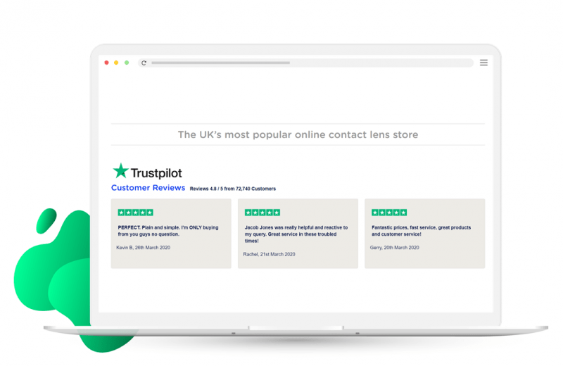
Source: visiondirect.co.uk
Product pages
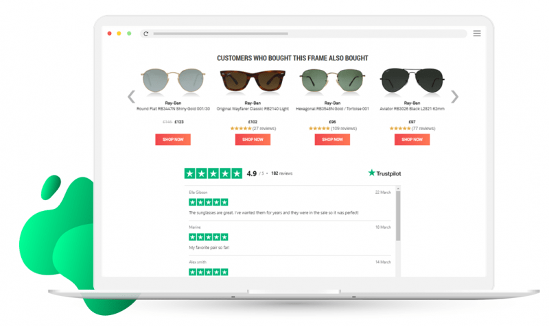
If a shopper lands directly on one of your product pages, make sure you help them over the finish line rather than scare them away from your site. Almost 1 in 3 shoppers (30%) want to see product ratings and reviews, so it’s important to prominently display this trust signal on your product pages to reduce your bounce rate.
Sunglasses Shop includes their Trustpilot rating with several reviews at the bottom of their product pages.
Source: sunglasses-shop.co.uk
User-generated content
User-generated content (UGC) is marketing at its most authentic, for example giving shoppers the chance to see that hat they want on the heads of real customers.
If shoppers aren’t given the opportunity to see these snapshots of your products or services in the wild, they might be forced to leave your site and resume their search elsewhere.
In fact, 1 in 3 shoppers prefer to see a product as it is worn or used by real people as opposed to professional product images, so it pays to use this social proof tactic within your site content.
By including customers’ photos on their product pages, & Other Stories gives shoppers an accurate idea of how the product will fit into their lives, building trust with their brand and enabling them to showcase their community of happy customers.

Source: stories.com
2) Pique your shoppers’ interest with product recommendations
Your shoppers are busy people with places to go and competitor sites to browse. Make their lives easier by helping them find products that will resonate with them, without having to waste precious time browsing through every inch of your store and thus lower your website’s bounce rate.
A great way to reduce your website page’s bounce rate is with product recommendations. If the visitor in question is brand new to your site, you can personalize recommendations based on contextual data, such as location, or use personification tools such as Fresh Relevance’s Price Affinity Predictor, hich allows you to identify the desired price for new visitors who haven’t interacted with your website yet and display relevant recommendations using those insights.
For returning shoppers, you can use past purchase and browse data to personalize the product recommendations they see. 1 in 4 shoppers want retailers to make it easy for them to discover more products they might like, so it pays to personalize those recommendations as much as possible to keep shoppers interested and reduce bounce rates.
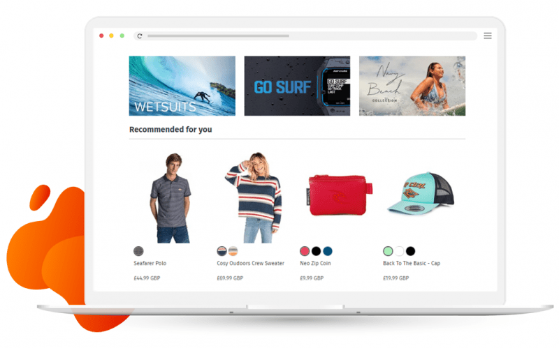
Rip Curl looks at the shopper’s product purchase history, and compares it with other shoppers who’ve viewed those products, using machine learning to recommend the most likely eventual purchases. The company boosts click-through rates by using the heading ‘Recommended for you’ to signal to shoppers that these are items specifically chosen for them.
Source: ripcurl.eu
3) Entice shoppers to stay with exit intent popovers
A well-timed popover that appears just as the shopper is about to leave could be what it takes to keep them on your site and reduce bounce rates. To maximize engagement, include a compelling call to action and clearly show the value you’re offering. This is your last shot at avoiding the shopper bouncing, so give them a reason to stay.
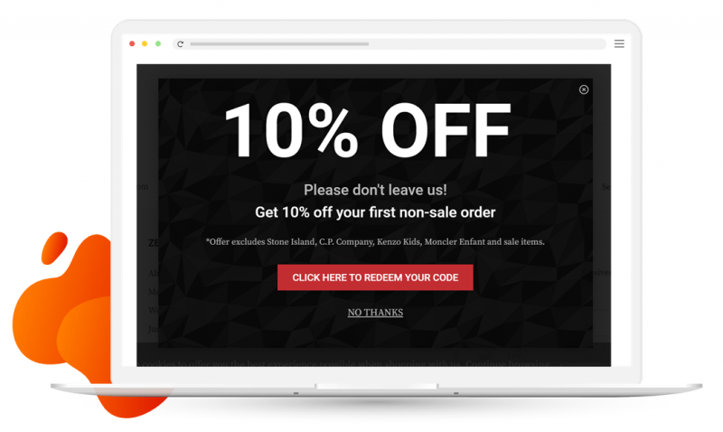
Zee & Co offers new shoppers who are about to leave the site a 10% discount off their first order, giving them a code that appears on clicking the CTA. This entices the shopper to stay on the website and continue browsing to find the perfect product to use their discount on.
Source: zeeandco.co.uk
4) Showcase your payment options on product pages
If your store offers multiple payment options, make sure you shout about this on your product pages. Some shoppers might be more comfortable paying with PayPal, or others might prefer to split the cost of their order with a tool like Klarna. Your job is to make it as easy and convenient as possible for consumers to purchase your goods or services.
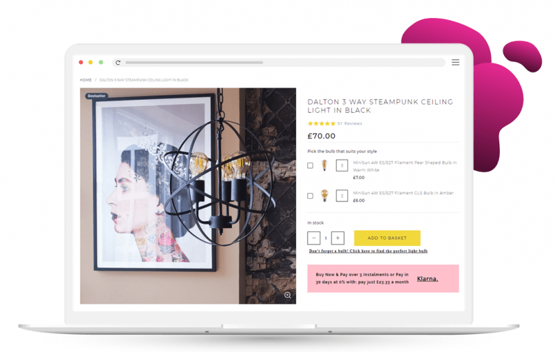
LSE Retail implemented a dynamic banner to their product pages to highlight the option to pay via Klarna, displaying the exact cost per payment. This gives their customers the power to plan their spending more effectively. With the majority of traffic coming through to the retailer’s product pages, it was vital to optimize this part of their eCommerce site to reduce bounce rates.
Source: iconiclights.co.uk
5) Keep shoppers happy with fast page speed
We’ve all experienced it. That feeling of frustration when a website you’re keen to get stuck into takes forever to load.
Slow-loading pages can be a huge contributing factor to high bounce rates, causing crabby customers to click away to speedier sites.
Google has even announced an update to their algorithm – Core Web Vitals – that focuses on page experience, with page speed being a key performance indicator. So not only will a slow-loading site impact your bounce rate, it might also hinder your chances of being discovered via search in the first place.
t’s therefore crucial to test and monitor your site speed to help you improve the customer experience and reduce your bounce rates. Google’s PageSpeed Insights scores and compares your site’s performance on both mobile and desktop.
Final thoughts
If your bounce rate is above the industry average, you should consider optimizing your customer experience using the 5 tactics covered here.
Give shoppers those all-important trust signals with social proof cues such as ratings and reviews and user-generated content. Display product recommendations personalized to each shopper to help them products that are most likely to interest them and keep them on your site. Use exit intent popovers to catch your shoppers’ attention just before they leave your site, and entreat them to stay with a compelling call to action. Make sure you showcase all your payment options on your product pages to make it as easy and convenient as possible for consumers to purchase from your store, and finally, monitor and optimize your site speed to avoid annoying your shoppers before they’ve had a chance to browse.
Discover how 21 brands optimize the customer journey with personalization in our Ultimate Ecommerce CRO Lookbook.


![Download The Ultimate Ecommerce CRO Lookbook [new visitors edition]](https://no-cache.hubspot.com/cta/default/483487/1d1bcbc2-6a95-414d-b7e0-dd6c2e2e65a2.png)
