Your website’s navigation bar (sometimes known as navbar) is often the first touchpoint your visitors interact with to guide them to specific products or categories. So it’s crucial to ensure your navigation bar is as helpful and engaging as possible. An uninspiring or frustrating navigation experience could result in site abandonment and high bounce rates from website visitors.
Not only that, a good navbar will improve your SEO, as search engines use navbars to index your site and bring context to a page.
Successful brands use their navbars wisely by adding dynamic content to their dropdown menus that showcases product recommendations, special offers, and more to help their website visitors discover the best their website has to offer. Dynamic content in navbars is just one of many ways marketers can use website personalization impress and convert online shoppers.
Here are 7 real-life dynamic content navigation examples that we think really hit the mark (plus, 4 bonus examples to up your website navigation structure game).
Download now: The Dynamic Content Playbook [free eBook]
1. Franklin Sports
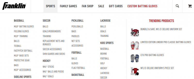
Franklin Sports make use of high-converting social proof and product recommendation tactics to highlight trending products in their navigation bar.
Displaying this type of product recommendation from the get-go works well for customers at the research stage who are seeking out extra information about your products, as well as new shoppers whose preferences you don’t yet know.
Franklin Sports could take their social proof tactics to the next level by including star ratings in their website navigation bar to show customers that these are products worth looking at.
2. Space NK
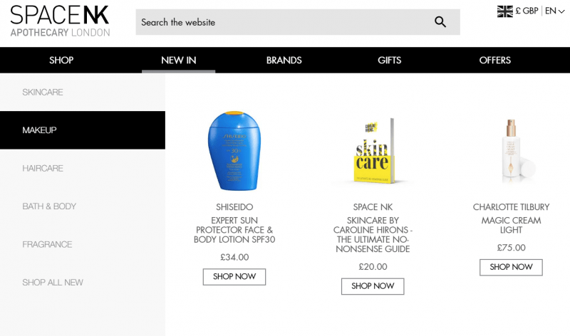
Space NK’s website navigation bar showcases new arrival product recommendations in their ‘New In’ category, providing shoppers with real-time pricing information alongside each product.
Recommending your newest products within the website navigation helps build excitement around the shopping experience and is particularly impactful in sectors driven by fast-moving trends, such as fashion and beauty. For returning customers, the highlighted products can be tailored according to the shopper’s preferred category.
3. Net-a-porter
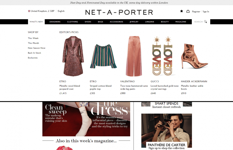
Net-a-porter offer a selection of products called the ‘Editor’s picks’ in their website navigation bar. Expert guidance from the Editor lends a more personal tone to these product recommendations. The images can be switched out by the editor each week or month to keep the web design fresh.
4. River Voyages
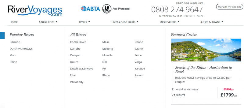
Highlighting your sale items is a well documented conversion booster. River Voyages include a ‘Featured Cruise’ section for each website navigation bar category. The use of real-time pricing data is crucial here to make sure consumers aren’t left disappointed by an offer that’s expired or is no longer available.
5. Zee & Co
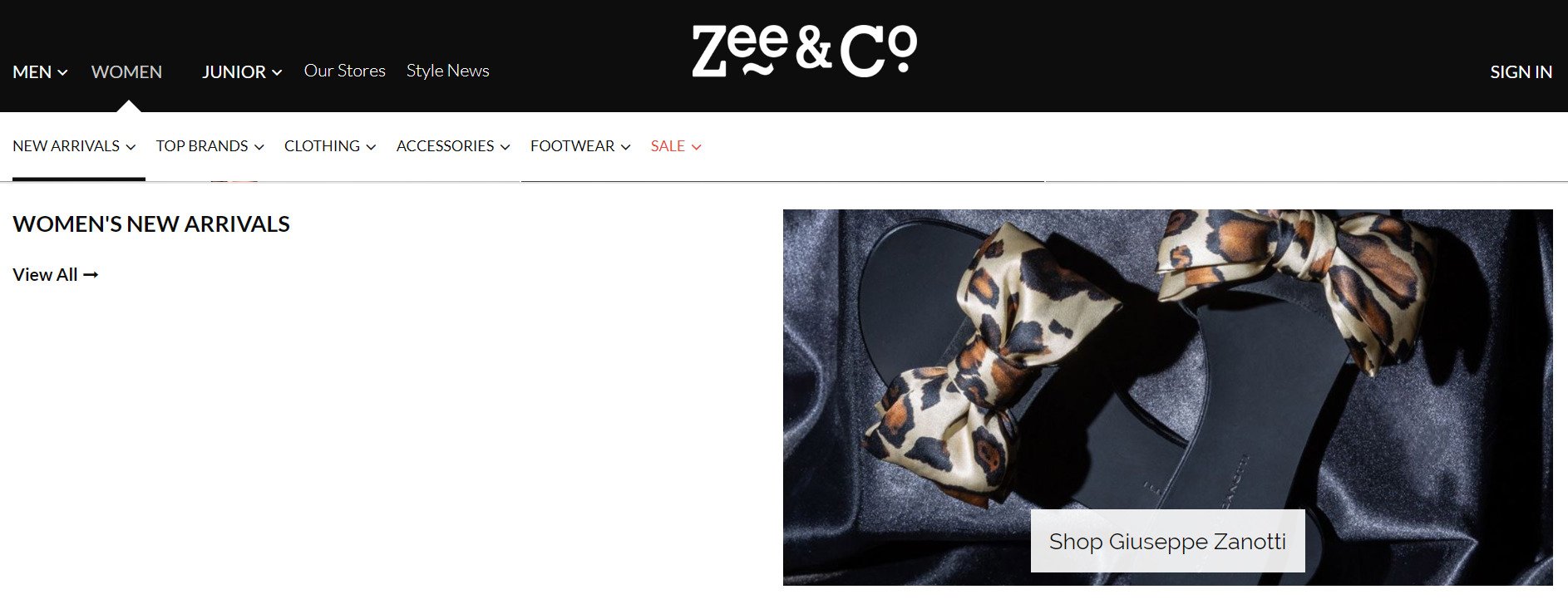
Zee & Co put the spotlight on specific brands across their website navigation bars.
Since customers tend to prefer brands or products they have seen multiple times, Zee & Co could harness the power of familiarity for returning visitors by tailoring the brand suggestion to the customer’s most purchased or browsed brand within their web design.
6. Karen Millen
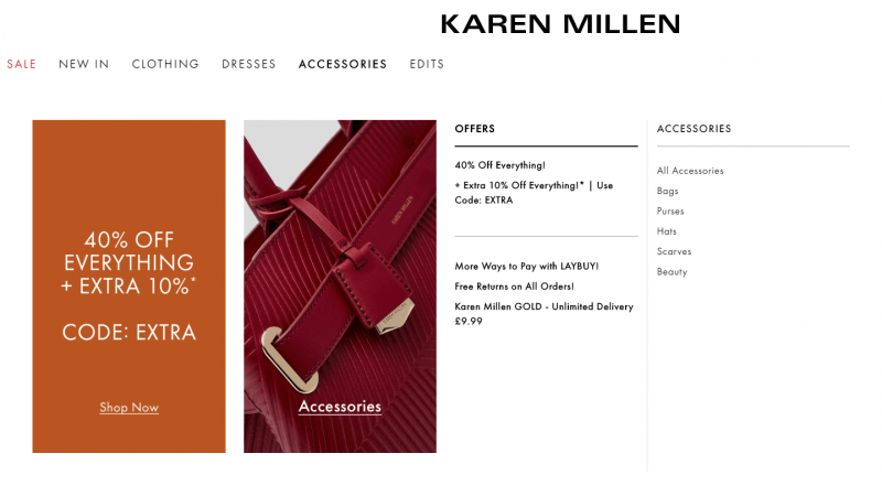
Coupons can be a nifty way to acquire new customers, reduce cart abandonment, reconnect with lapsed customers and help sell excess stock – and they can be used in the website navigation bar, too.
Karen Millen’s use of a coupon in their website navigation bar helps drive urgency towards this specific offer from the beginning of a visitor’s web session. A personalized coupon would be even more effective, encouraging customers who have recently been browsing specific products and categories on the website to make a purchase.
7. Tap Warehouse
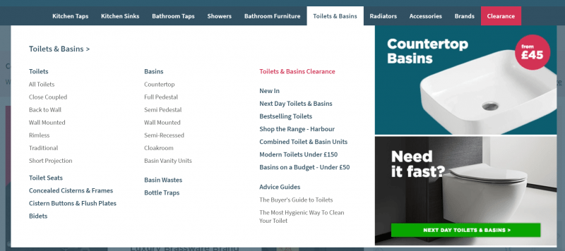
46% of consumers say they’ve abandoned their carts due to delivery concerns. So it’s important to have clear signposting across your website to alleviate these doubts. The earlier a customer knows their delivery options, the more likely they are to stick around and explore your products.
Tap Warehouse use their website navigation bar to highlight next day delivery options. In navigation examples that make use of this technique, using real-time inventory data is vital to make sure the items displayed when clicking on the banner are in fact available for next day delivery.
Boost your navigation bar with these bonus website navigation examples:
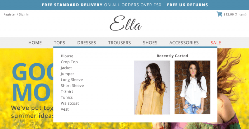
8. Last Carted Items
Ramp up your personalization efforts further by providing abandoned cart information in the website navigation bar to encourage returning customers to take action and complete a purchase.
9. Countdown Timer
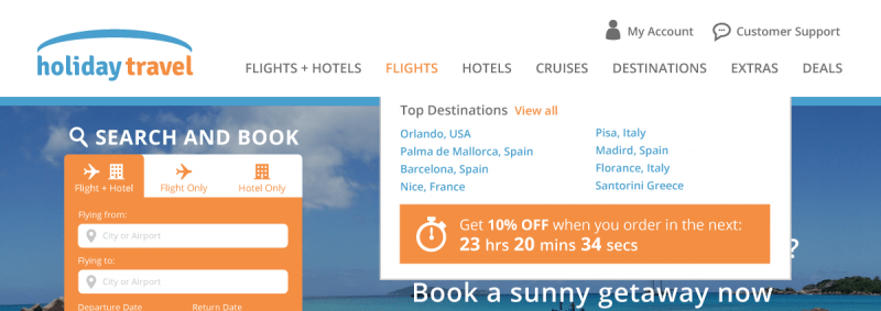
You could also place a countdown timer into your website navigation bar to create urgency around making a purchase. For example, try highlighting the cut-off time for next day delivery.
Find out how Cottages.com drive online sales and boost visitor engagement with countdown timers in their website navigation bar.
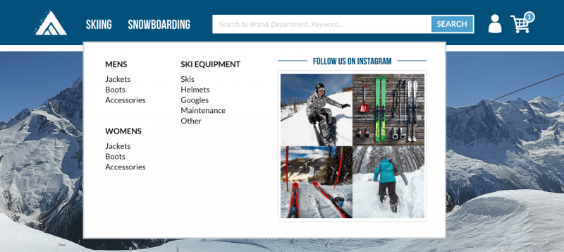
10. Social Media
Showcasing your social media in your “Contact” or “Community” website navigation bar category is a great way to increase engagement and let your customers connect with you on a more personal level.
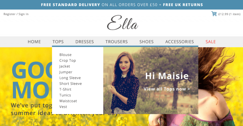
11. Name Personalization
Finally, using a simple personalized name banner in your website navigation is an effective way to give your returning customers a friendly welcome back.
Fresh Relevance functionality allows you to tailor the website navigation bar content to your business goals, or to personalize it for each individual, without you needing any coding knowledge. You can even combine approaches for optimal results.
Download your copy of The Dynamic Content Playbook to learn how to get started with real-time content in your marketing.


